A luxury milestone event concierge launching with no brand assets. We built the complete identity, from positioning to the final visual element, in three weeks.
Coastex Concierge is a luxury milestone event planning service, proposals, bachelorette trips, destination weddings, honeymoons, baby showers, and more milestone events, coordinated anywhere in the world. The business was built around an exceptional service offering and a founder with genuine expertise. The problem: no brand to show for it.
When Coastex came to Groundwork they had a name and a clear vision. What they didn't have: visual assets, a positioning framework, a defined tone of voice, or anything a client could look at and immediately understand. They were weeks from launch and needed all of it.
The challenge: build a brand that felt premium and established from day one. It had to compete credibly against luxury travel and concierge names with decades behind them, while being entirely new. The identity had to carry the weight of trust on day one.
Coastex also operates worldwide across very different client profiles: European couples planning weddings in Positano, American brides booking bachelorette trips to Ibiza, international clients arranging proposals in Venice. The brand had to feel genuinely global and equally at home in all of them.
The strategy was clear: signal quiet confidence and earned authority. Not flashy luxury, but the understated elegance that people with real discernment recognise immediately. We identified four principles to guide every design decision, mirroring the values Coastex themselves work by: Taste, Discretion, Clarity, and Coordination.
We ran a structured discovery session with the founder: mapping the competitive landscape, defining the audience in detail (couples, groups, and high-net-worth individuals planning milestone moments), and isolating what made Coastex genuinely different. The positioning we landed on: the concierge that stays by your side through every milestone, not just the event itself. That through-line shaped everything.
The primary mark is a refined circular emblem, a deliberate reference to seals of quality and continuity. The CC letterform at its centre sits in a classical serif that reads as European craft without affectation. We built the mark to hold at every scale: full emblem on letterheads, favicon in a browser tab, embossed on physical materials. The wordmark pairs it with "Coastex Concierge" in a tight, confident lockup.
A five-colour palette anchored in deep navy and warm ivory: serious and elegant, warm without being casual. A precise gold accent supplies luxury without tipping into gaudy. We stress-tested the palette across print, digital, and dark backgrounds before finalising, so the brand reads with equal confidence on a screen, a business card, and a proposal header.
Display type is a classical serif: high-contrast strokes, slightly condensed proportions, and italic cuts that read as refined rather than retro. Body copy is a precise sans-serif that pairs cleanly without competing. We documented the full hierarchy (display, subheading, body, caption, label) with size scales, weight pairings, and usage rules for print and web.
The guidelines document covers every element of the identity: logo usage and exclusion zones, colour values for print and digital, typography hierarchy with examples, imagery direction, tone of voice with sample copy, iconography, and application examples across key touchpoints. A working document Coastex and any future collaborator can actually use.
As part of The Foundation package we delivered full visual direction for the website: layout principles, component hierarchy, imagery style and sourcing, animation principles, and a design system the development team could build from directly. The result holds the brand at every scroll: same palette, same typographic rhythm, same confident restraint.
The colour system answers two imperatives: legibility across every medium, and an emotional register that reads premium without ostentation. Every colour has a defined role. None were added for decoration.
A classical high-contrast serif with real historical roots. Its proportions sit between the restraint of French typography and the warmth of Italian book design. Used large for headlines, and in italic for pull quotes and emphasis.
A precision-engineered sans-serif with exceptional legibility at small sizes and in digital contexts. It carries no stylistic baggage, no unnecessary character, no retro associations, which lets the display typeface do the emotive heavy lifting while the body text simply communicates with clarity. Used for navigation, body copy, labels, buttons, and metadata.
Coastex launched with a brand that said what the business is and what it stands for, immediately. The system we delivered covered logo, colours, typography, guidelines, stationery, social assets, and full website direction. It meant the team could move fast across every channel without a single inconsistency creeping in.
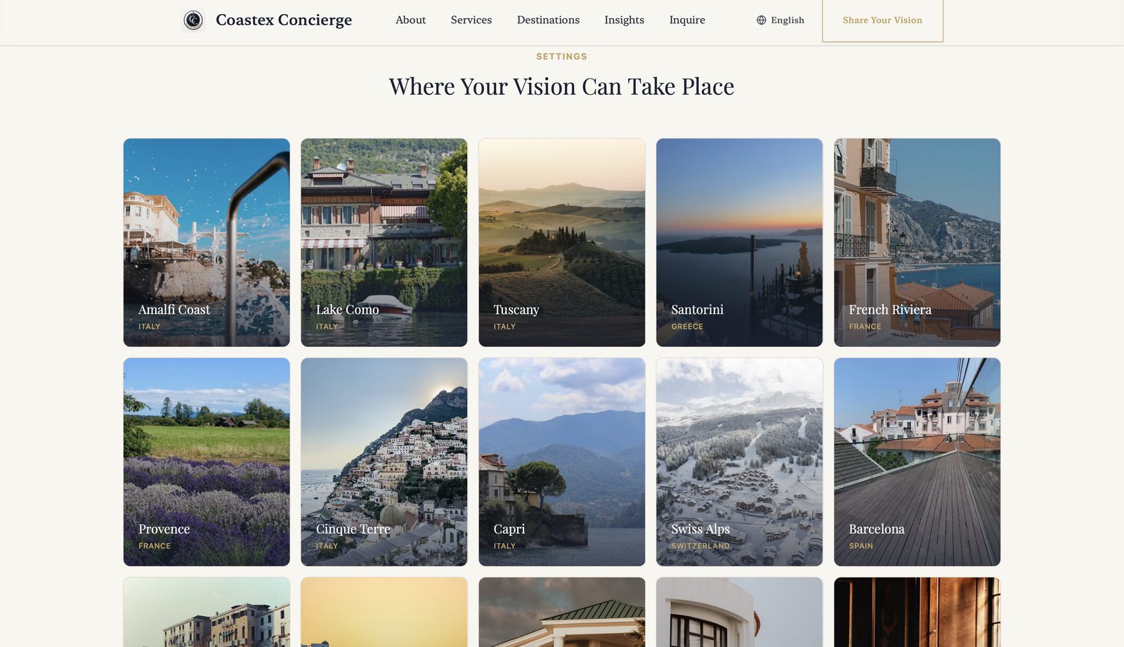
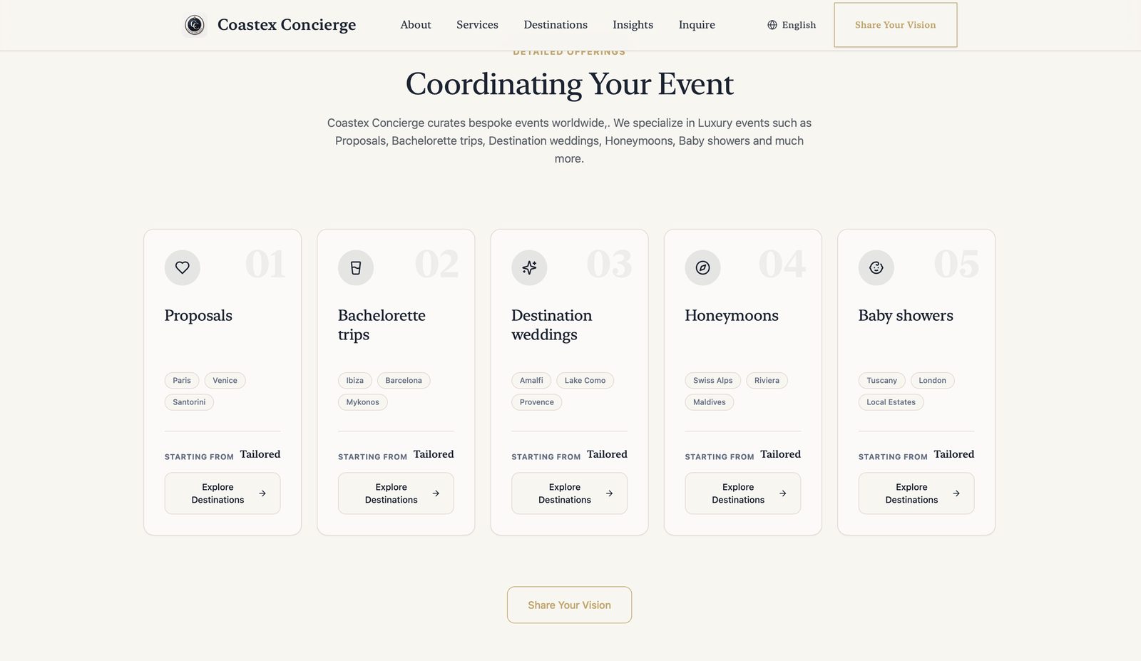
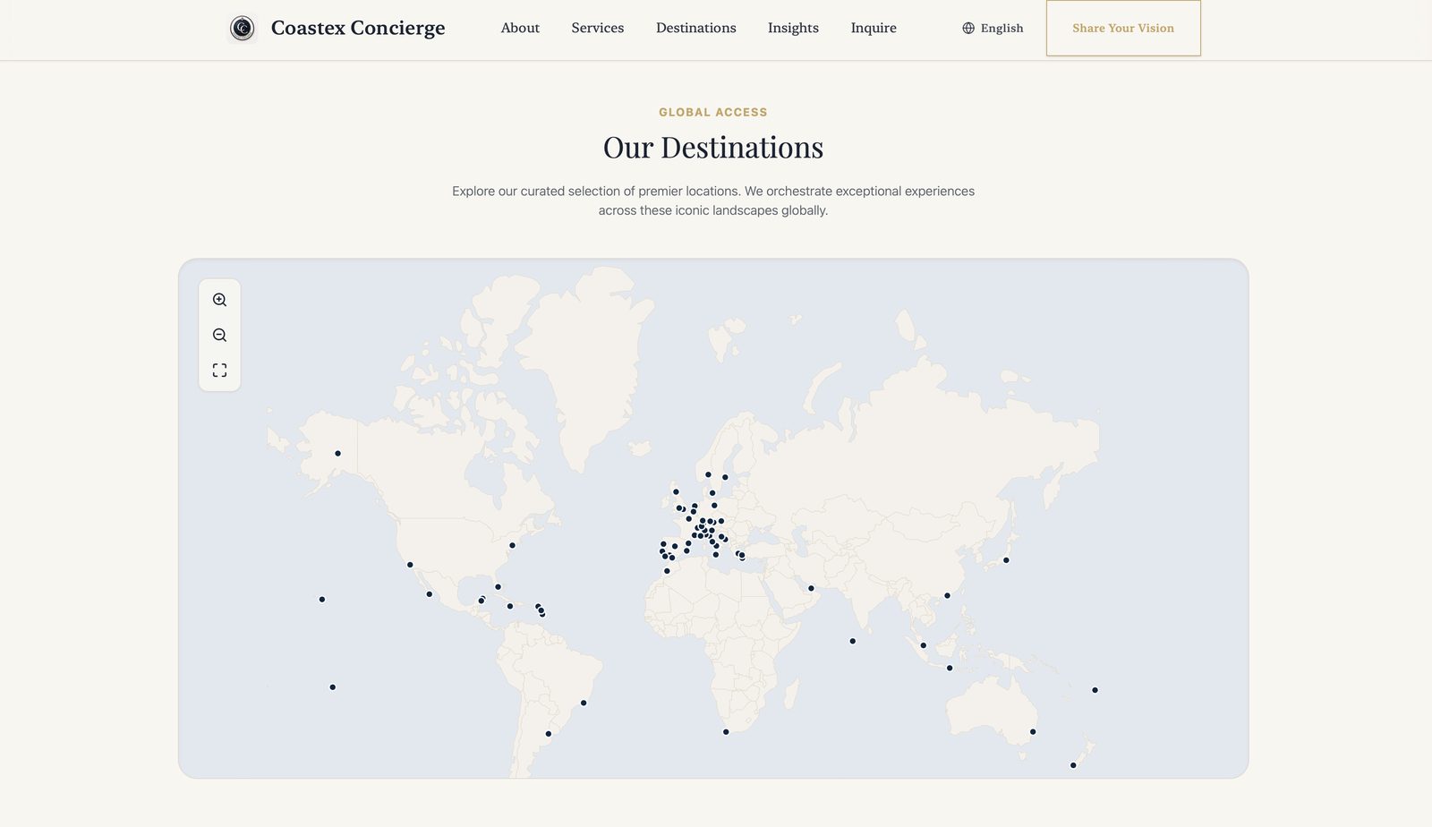
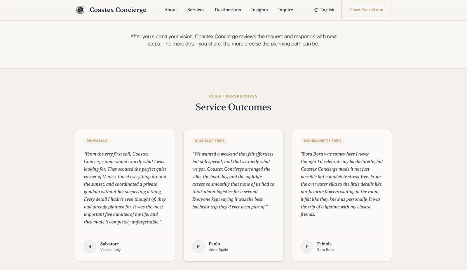
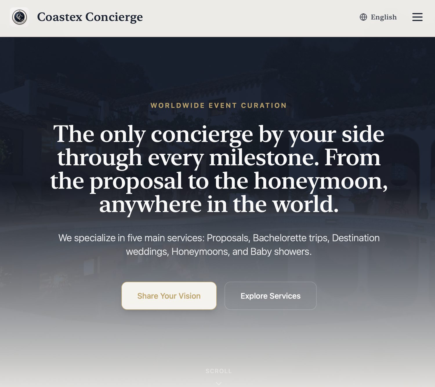
The visual direction translated directly into the live site at coastexconcierge.com. Every section carries the system we built: an interactive world map plotting 70+ destinations, five numbered service cards under Coordinating Your Event, a destination gallery titled Where Your Vision Can Take Place, a values section running Taste, Discretion, Clarity, and Coordination, and a Service Outcomes section carrying real client testimonials. The site also ships with a language switcher, because the audience was never only English-speaking.
Within months of launch Coastex was coordinating events across six continents and publishing 50+ bespoke celebrations across 70+ destinations, with a brand strong enough to sit alongside luxury travel names decades older. It never had to grow into the business. It was built for where the business was going, not where it started.
See the Live Site →These are screenshots of the live site at coastexconcierge.com. Every section runs the identity system we delivered: the same palette, the same typographic hierarchy, the same restraint. Nothing drifted between handover and launch.
We came to Groundwork with a name, a vision, and zero brand assets. Three weeks later we had a complete identity, logo, colours, typography, brand guidelines, the lot. The handover session alone was worth it: they walked us through everything, explained every decision, and made sure we could use the brand confidently from day one. Coastex launched looking like it had been operating for years. That's entirely down to Groundwork.
These are real testimonials from Coastex Concierge's clients: the people who found, trusted, and booked based on the brand we built. A brand that converts is the only metric that matters.
A Miami-based professional services firm. Full brand identity, stationery suite, and digital presence. Currently in production.
A US e-commerce brand preparing for a Series A raise. Rebrand and full digital visual system overhaul.
We're currently accepting new projects. If you're a founder or business owner who needs a brand built properly, let's talk.
Start a Project →We're based in Miami and currently accepting new projects across the US and internationally.